Blog Customer FeedbackUser Interface Examples: 10 Great UI Designs to Learn From
User Interface Examples: 10 Great UI Designs to Learn From
A breakdown of 10 great user interface examples, from Spotify to Stripe, plus the main types of UI and the design principles that make each interface work.


The fastest way to get better at UI design is to study the interfaces you already love using. You open them every day without thinking, which is exactly the point. Good design gets out of your way.
So instead of another dictionary definition, this guide breaks down 10 great user interface examples, the main types of UI with a quick example of each, and the design principles that tie them all together. 👇
Key takeaways
- A user interface (UI) is the layer where a person and a product meet: the screens, buttons, menus, and gestures you use to get something done.
- Most UIs fall into a few types: graphical (GUI), touchscreen, voice, and command-line, with the GUI being the one most people use every day.
- Great interfaces share the same principles: clarity, consistency, instant feedback, and a clear visual hierarchy.
- The best UI examples nail one thing exceptionally well: Spotify with personalization, Duolingo with gamified feedback, Stripe with clarity, and so on.
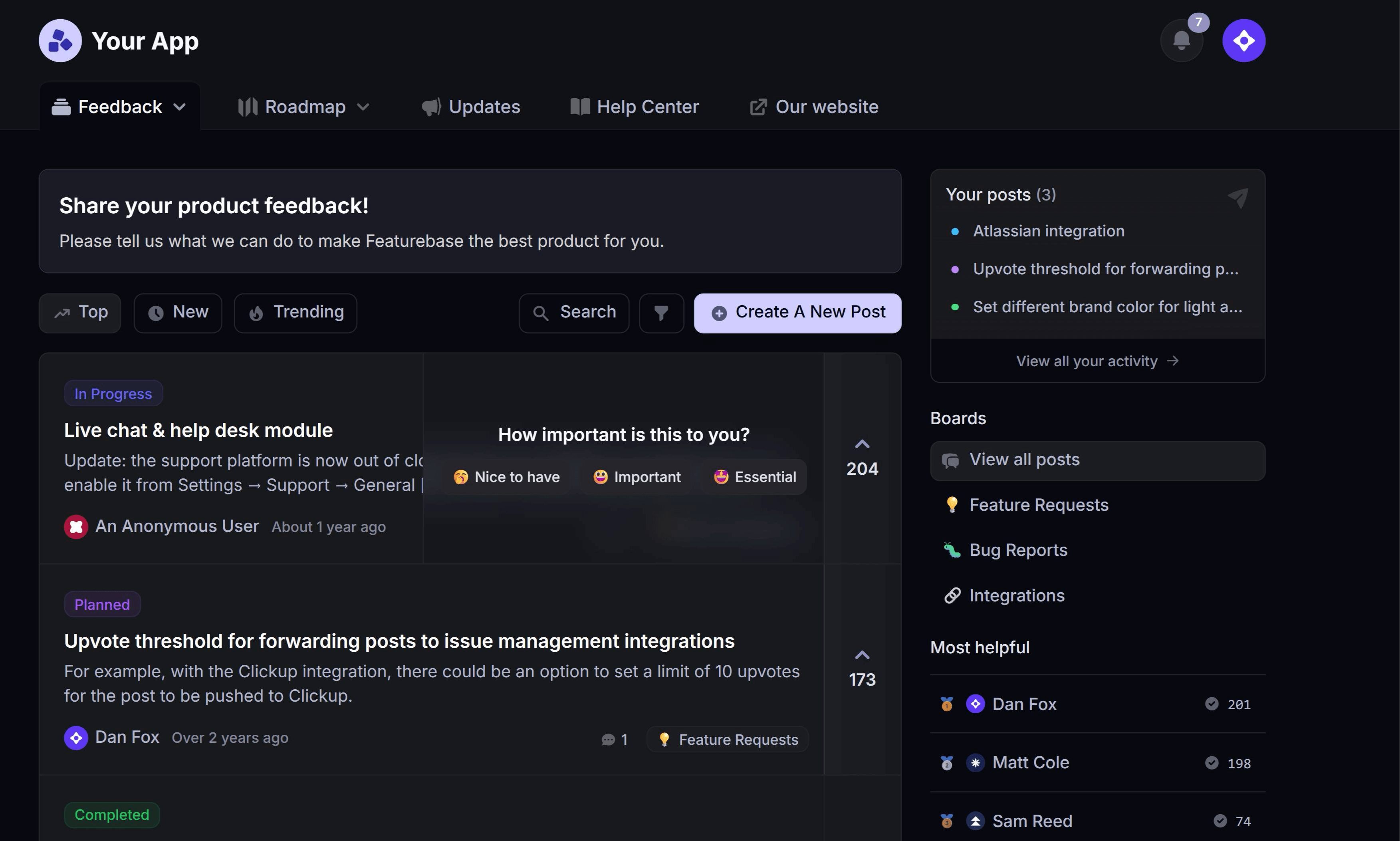
- Featurebase✨ is a modern example of clean product UI, with feedback boards, roadmaps, and a changelog you can click through today.
What is a user interface?
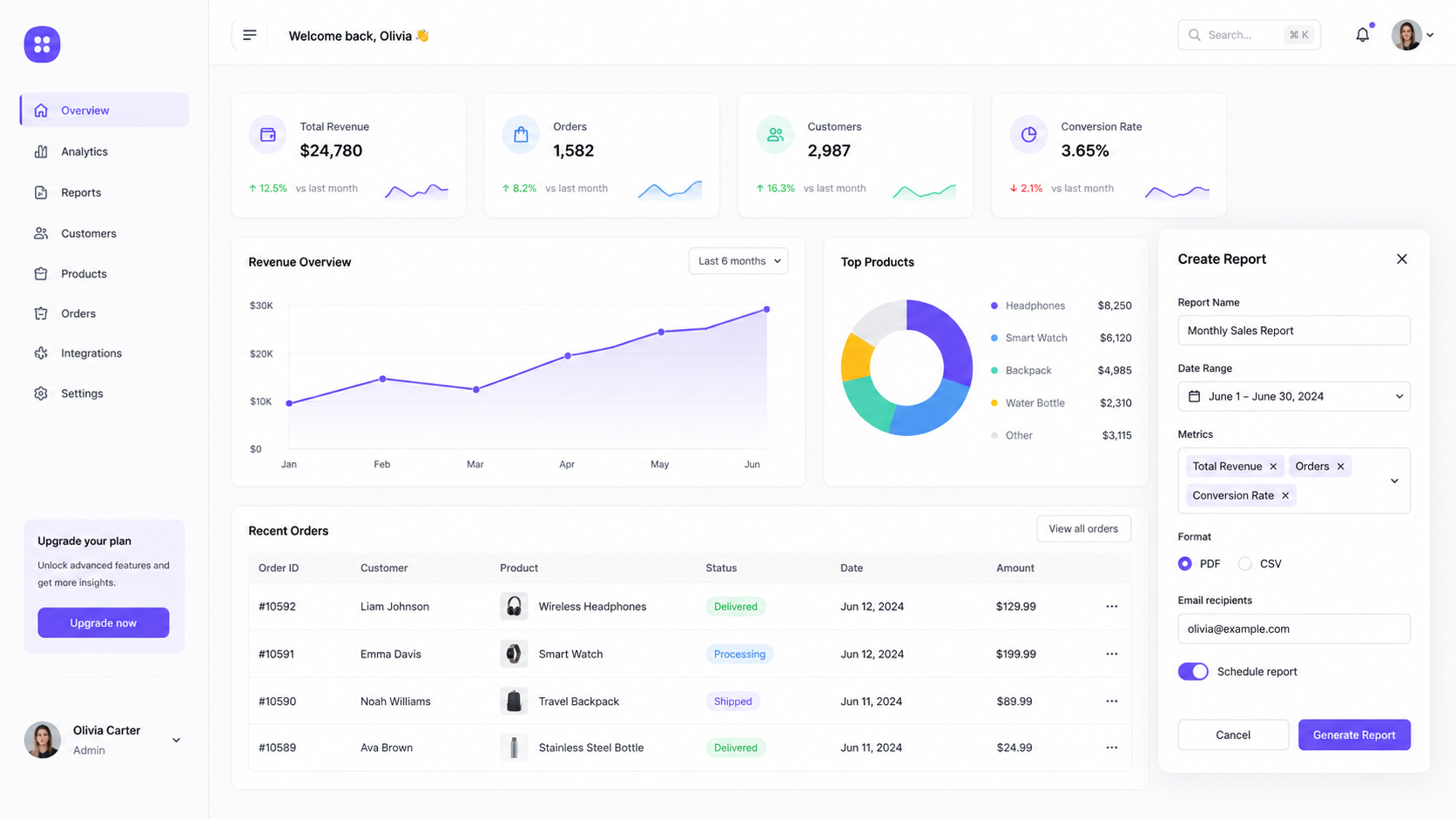
A user interface (UI) is everything you interact with to use a product. It's the visual and interactive layer sitting between you and the technology underneath, made up of the buttons, text, icons, menus, and gestures that let you get things done.
Think of it as the dashboard of a car. You don't need to understand the engine to drive. You just need a steering wheel, pedals, and a speedometer laid out in a way that makes sense. A good UI does the same job for software: it hides the complexity and gives you a clear, simple way to act.
UI is often confused with UX (user experience), but they aren't the same thing. UI is the specific interface you see and touch. UX is the whole feeling of using the product, start to finish. A beautiful interface with a confusing flow has good UI and bad UX, so the two have to work together.
The main types of user interfaces (with examples)
Not every user interface looks like an app on a screen. Over the years, interfaces have evolved to match how we actually interact with technology, and most of them fall into a handful of types.
Here are the main types of UI, each with a real example you already know:
- Graphical user interface (GUI): the visual interface built from windows, icons, buttons, and menus that you navigate with a cursor or your finger. Your laptop desktop and almost every app you use are GUIs, which makes it the most common type by far.
- Touchscreen interface: a GUI you control directly by tapping, swiping, and pinching instead of using a mouse. Your smartphone is the obvious example, where the screen is both the display and the input.
- Voice user interface (VUI): an interface you operate by speaking, with no screen required. Siri, Alexa, and Google Assistant are the everyday examples people reach for.
- Command-line interface (CLI): a text-only interface where you type commands to tell the computer what to do. Developers use it daily through the terminal, trading visual polish for speed and precision.
- Form-based interface: a structured interface built around fields you fill in, used whenever a product needs specific information. A checkout page or a flight booking form is a form-based UI.
- Menu-driven interface: an interface that walks you through a set list of options one screen at a time. An ATM or a phone support menu is the classic example.
Most modern products actually blend several of these. Your phone is a touchscreen GUI that also has a voice assistant baked in.
10 great user interface examples to learn from
The best way to understand good design is to look at UI examples that get it right. Each of these interfaces is loved for a specific reason, so I've called out the exact design decision worth learning from in every one.
Spotify - personalization done right
Spotify's interface feels like it was built for you, because it more or less was. The home screen surfaces playlists, artists, and mixes based on what you actually listen to, so the content does the heavy lifting instead of the navigation.
The design lesson is restraint. Spotify leans on a dark, content-forward layout that pushes album art and recommendations to the front and keeps controls minimal. Personalization only works when the interface around it stays quiet.
Duolingo - gamified feedback that keeps you going
Duolingo turned language learning into something people do on a streak. Every correct answer triggers a little animation, a sound, and a progress bar nudging forward, so you always know how you're doing.
That constant, playful feedback is the takeaway. Small rewards and clear progress indicators make a repetitive task feel like a game, which is a big reason people come back day after day.
Notion - flexibility without clutter
Notion is a blank canvas that can become a note, a database, a wiki, or a project tracker. That flexibility could easily feel overwhelming, but the interface stays calm by hiding options until you need them.
The lesson is progressive disclosure. Notion's clean, mostly white layout and the "/" command menu keep powerful features one keystroke away without crowding the page. Complexity is available, not in your face.
Stripe - clarity for a complex product
Stripe deals with something genuinely complicated, moving money online, and its interface makes it look effortless. The dashboard and documentation are famous among developers for being clear, well-organized, and easy to scan.
What to steal here is information hierarchy. Stripe uses generous spacing, consistent typography, and a logical structure so a dense subject never feels dense. Good UI can make hard things feel approachable.
Airbnb - visual-first and consistent
Airbnb's interface puts photography front and center, which fits a product built on trust and wanderlust. You browse places to stay through big, beautiful images long before you read a word of text.
The design lesson is consistency. Airbnb's cards, filters, and maps behave the same way across the whole product, so once you learn one screen, you know how to use them all. A consistent system reduces the effort of learning.
Figma - collaboration built into the canvas
Figma made design a team sport by putting real-time collaboration directly into the interface. You can see teammates' cursors moving on the same file, comment in context, and edit together without exporting anything.
The takeaway is designing for the actual workflow. Rather than bolting collaboration on as a separate mode, Figma built it into the core canvas, which is why it became the default tool for so many teams.
Slack - a conversational interface that scales
Slack took the simple idea of a chat window and shaped it into a workspace. Channels, threads, and a persistent sidebar keep a huge amount of activity organized without losing the casual feel of a conversation.
What's worth learning is thoughtful organization. Slack uses a clear left-hand navigation and subtle formatting to make sense of thousands of messages, proving a familiar pattern can carry serious complexity.
Calendly - one job, zero friction
Calendly does one thing, booking a meeting, and its interface removes every possible obstacle from that job. You pick a day, pick a time, confirm, and you're done, often in under 15 seconds.
The design lesson is focus. By stripping the flow down to only the steps that matter, Calendly turns a task that used to take a dozen back-and-forth emails into a couple of clicks. Doing less, better, is a real feature.
Google Maps - contextual, real-time information design
Google Maps layers an enormous amount of data, traffic, businesses, reviews, transit, directions, onto a single map without overwhelming you. The interface shows what's relevant to your current task and tucks the rest away.
The takeaway is context. Maps surfaces the right controls at the right moment, like turn-by-turn directions once you start navigating, so the interface adapts to what you're trying to do instead of showing everything at once.
Apple iOS - consistency as a system
iOS is less a single screen and more a set of rules every app follows. Consistent gestures, typography, and components mean an app you've never opened still feels immediately familiar.
The lesson here is the power of a design system. Because Apple defines shared patterns across the whole platform, users carry their knowledge from one app to the next, and the entire experience feels coherent.
What makes a good user interface?
Look closely at the examples above and the same handful of principles show up again and again. A great UI usually gets these right:
- Clarity: the interface makes the next action obvious. Users should never have to guess what a button does or where to go next.
- Consistency: buttons, colors, and patterns behave the same way everywhere, so learning one screen teaches you the rest.
- Feedback: every action gets a visible response, like a button state change or a loading indicator, so users always know something happened.
- Visual hierarchy: size, spacing, and contrast guide the eye to what matters most first, instead of treating everything as equally important.
- Simplicity: the design shows only what's needed for the current task and hides the rest until it's relevant.
- Accessibility: the interface works for everyone, with readable contrast, legible text, and support for keyboard and screen readers.
You can see these same principles in modern product tools. Featurebase's public feedback boards, for example, use a clean layout and clear hierarchy so users can scan ideas, vote, and comment without needing a manual.
Getting these right isn't just a nice-to-have either. In its landmark study on design, McKinsey found that the most design-driven companies grew revenue 32 percentage points faster and delivered 56 points higher total returns to shareholders than their peers over 5 years. Good UI is a business advantage, not just a coat of paint.
Building that advantage requires skilled UX and UI execution across complex user journeys. Teams often work with Superside, the world's leading AI-first creative partner for enterprises, to scale their product design.
Featurebase: a modern product UI worth studying
If you want a real-world example of clean SaaS UI you can click through today, Featurebase is a good place to look.
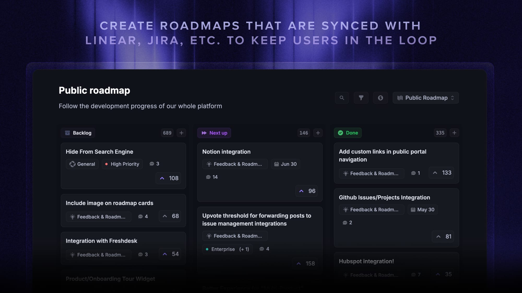
Featurebase is a modern feedback & support platform that helps product teams collect feedback, prioritize features, build roadmaps, and announce product updates, all in one place. It's loved by thousands of product teams from companies like Lovable, Raycast, and n8n. 💫
Top features:
- Feedback forum – Public feedback forum where users can submit ideas and vote on features helping you know what customers want
- In-app widgets – Embed feedback, changelog, and help center widgets directly in your product
- Prioritize by revenue – Link feedback with customer revenue, company size, and much more to better understand the impact of ideas
- AI feedback categorization - Automatically group large volumes of feedback into product areas, projects, or themes with AI.
- Automated email updates – Automatically notify users when their requested features are implemented
- Roadmaps – Create internal & public product roadmaps to keep users informed and build engagement
- Product updates – Publish release notes with a changelog page, in-app widget, and emails
- Surveys (NPS, CSAT, etc) – Create targeted surveys to ask users anything and measure customer satisfaction.
- Automatic AI translations – Automatically translate all feedback and comments to your customers / teammates native languages
- Integrations – Connects with Slack, Linear, Jira, HubSpot, and more
Pricing: Free plan available with unlimited feedback collection. Paid plans start at $29/seat/mo.
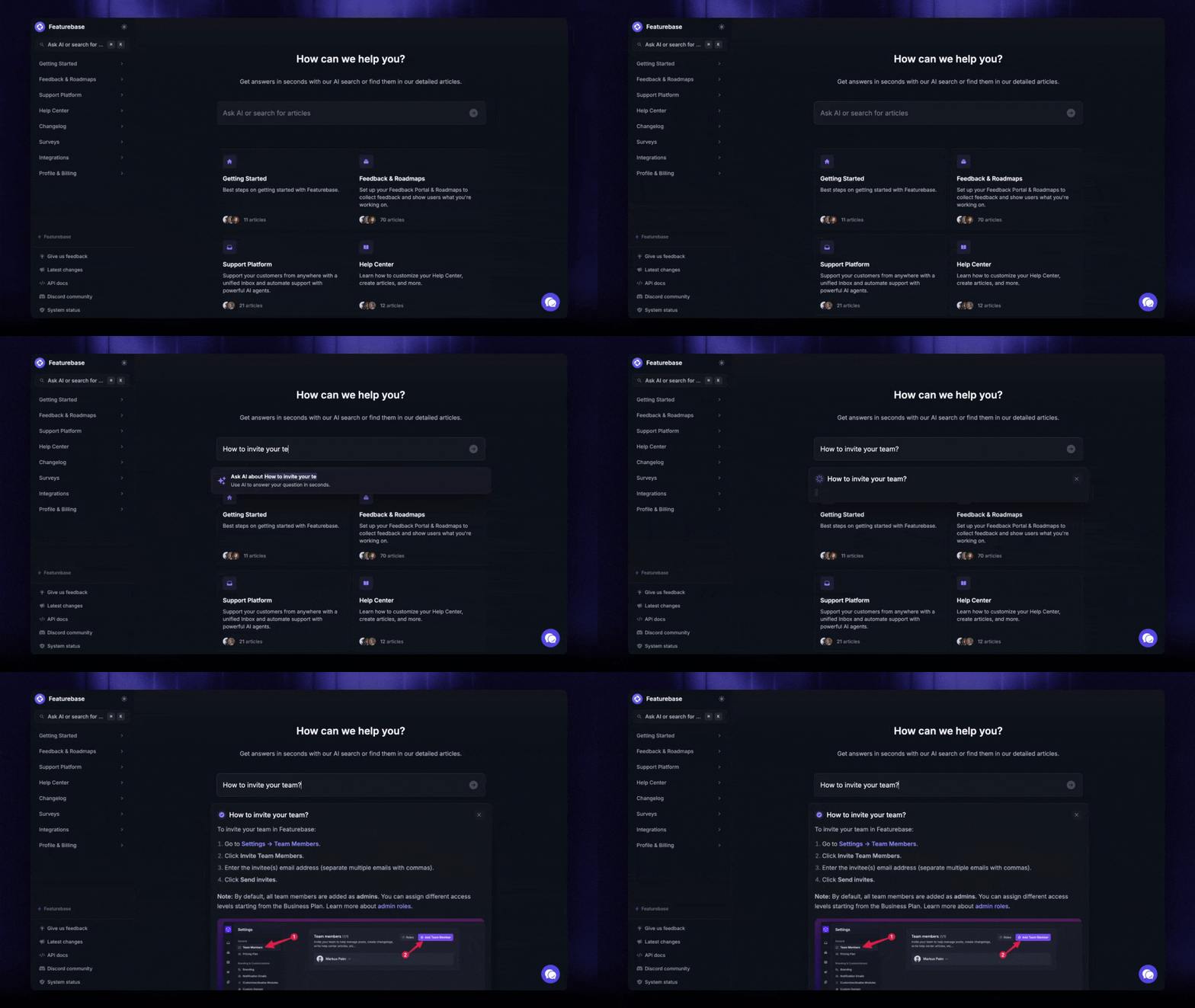
Instead of having 4+ different tools, Featurebase enables you to replace all your customer-facing tools by bringing your feedback collection, product updates, support, and help center together in one place to help you build products your users love.

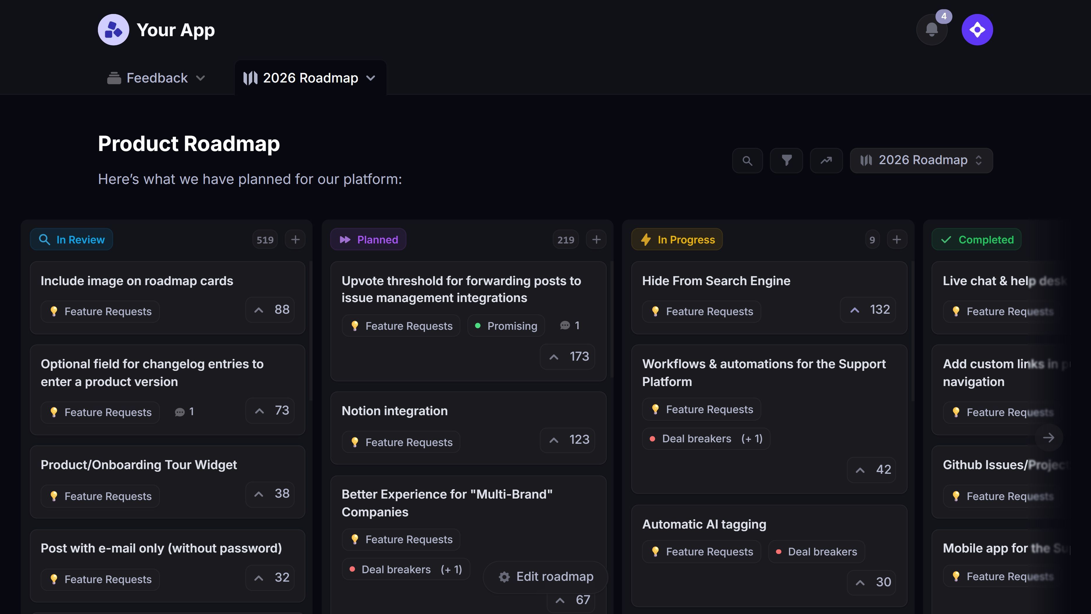
Start creating product roadmaps for free
Share what you’re building & keep teams and users aligned with modern roadmaps
Conclusion
Great UI isn't about flashy visuals. Every example in this guide works for the same reason: it makes the next action obvious and gets out of the user's way. Study the interfaces you love, borrow their principles, and keep the design in service of the task.
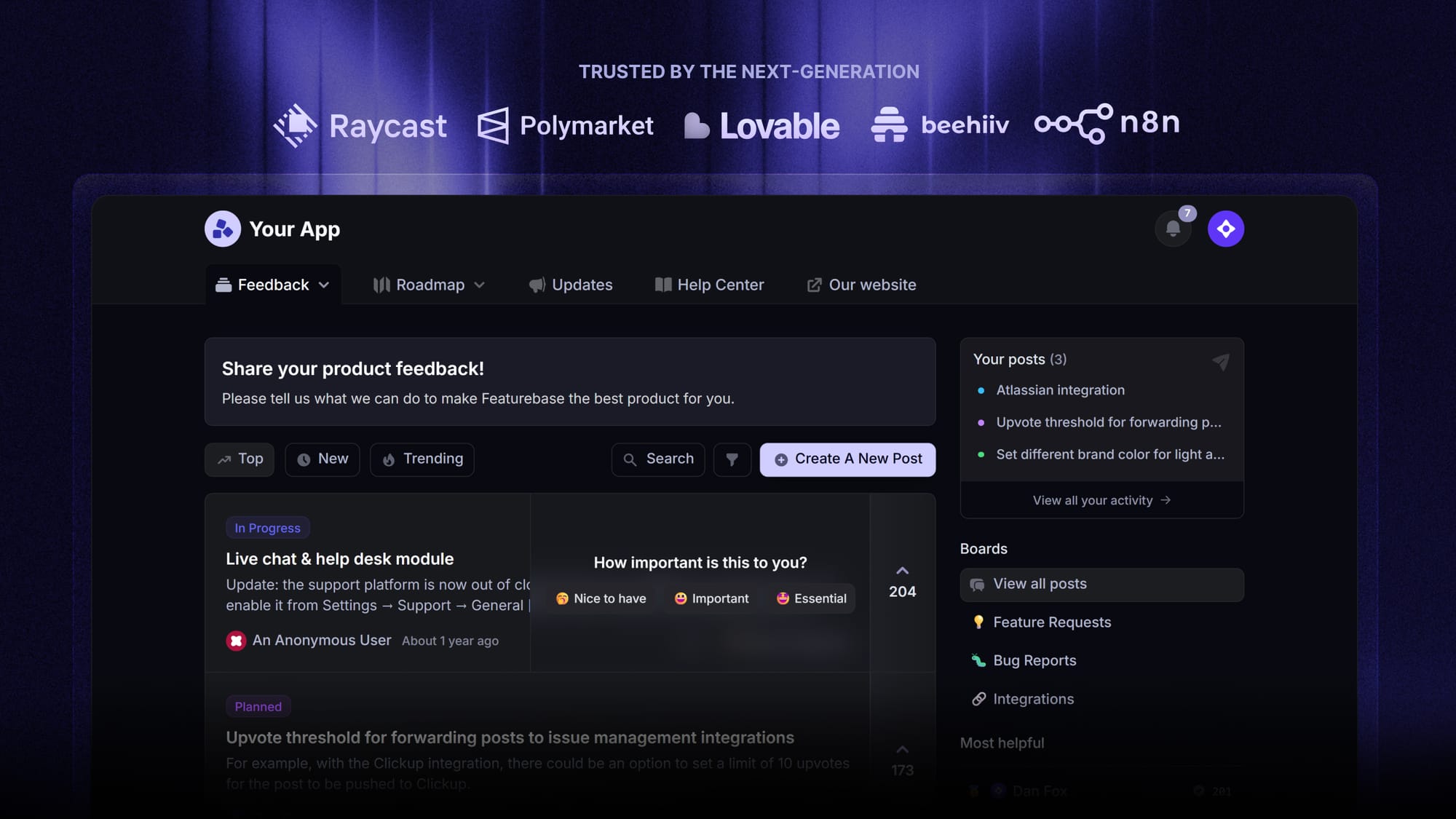
Featurebase is a modern feedback and support platform with a clean, uncluttered interface your users will actually enjoy using, from public feedback boards and roadmaps to a changelog and in-app widgets.
It comes with a Free plan and the onboarding takes minutes, so there's no downside to trying it. 👇
✨ Start collecting & managing feedback with Featurebase for free →
FAQs
What is the difference between UI and UX?
UI (user interface) is the specific screens, buttons, and controls you see and interact with. UX (user experience) is the overall feeling of using a product from start to finish, including how easy and pleasant it is. UI is one part of UX, and a product needs both to be good.
What is a graphical user interface (GUI)?
A graphical user interface is a visual way of interacting with a device using elements like windows, icons, buttons, and menus that you control with a cursor or your finger. It replaced older text-only command interfaces and made computers usable for everyone. Your desktop, your phone, and nearly every app you open are all GUIs.
What is the most common type of user interface?
The graphical user interface (GUI) is the most common type by a wide margin. Every smartphone, laptop, and app you use relies on visual elements like icons and buttons rather than typed commands. Its popularity comes down to being intuitive, since people can point and tap instead of memorizing commands.
Why is good user interface design important?
A good interface makes a product easier to use, which directly affects whether people stick with it or leave. It also shapes first impressions and trust within seconds of someone landing on your product. Design-driven companies even tend to outperform their peers financially, so strong UI is a real competitive advantage.
What is a real-life example of a user interface?
You use interfaces constantly without labeling them as such. Your smartphone's home screen, an ATM's on-screen menu, a car's dashboard, and a website's navigation bar are all everyday user interfaces. Anywhere you interact with a device to get something done, there's a UI involved.
How do you design a user-friendly interface?
Start by understanding your users and the specific task they're trying to complete, then design the shortest, clearest path to it. Prioritize clarity and consistency, give feedback for every action, and remove anything that doesn't serve the current task. Finally, test the interface with real people and refine it based on where they get stuck.